Introduction
Veusz
Veusz is a 2D and 3D scientific plotting package. It is designed to be easy to use, easily extensible, but powerful. The program features a graphical user interface (GUI), which works under Unix/Linux, Windows or Mac OS. It can also be easily scripted (the saved file formats are similar to Python scripts) or used as module inside Python. Veusz reads data from a number of different types of data file, it can be manually entered, or constructed from other datasets.
In Veusz the document is built in an object-oriented fashion, where a document is built up by a number of widgets in a hierarchy. For example, multiple function or xy widgets can be placed inside a graph widget, and many graphs can be placed in a grid widget. The program also supports a variety of 3D plots, including 3D point and surface plots. The program produces vector rather than rastered 3D output.
Veusz can be extended by the user easily by adding plugins. Support for different data file types can be added with import plugins. Dataset plugins automate the manipulation of datasets. Tools plugins automate the manipulation of the document.
Installation
Please go to the website of Veusz to learn more about the program. Links to binaries, distribution packages and the source package can be found in downloads. For source installation, please see the package INSTALL.
Getting started
Veusz includes a built-in tutorial which starts the first time the program is run. You can rerun it later from the Help menu. It also includes many examples, to show how certain kinds of plots are produced. For more help and link to a video tutorial, see help.
Terminology
Here we define some terminology for future use.
Widget
A document and its graphs are built up from widgets. These widgets can often be placed within each other, depending on the type of the widget. A widget has children (those widgets placed within it) and its parent. The widgets have a number of different settings which modify their behaviour. These settings are divided into properties, which affect what is plotted and how it is plotted. These would include the dataset being plotted or whether an axis is logarithmic. There are also formatting settings, including the font to be used and the line thickness. In addition they have actions, which perform some sort of activity on the widget or its children, like “fit” for a fit widget.
As an aside, using the scripting interface, widgets are specified with a “path”, like a file in Unix or Windows. These can be relative to the current widget (do not start with a slash), or absolute (start with a slash). Examples of paths include, /page1/graph1/x, x and ..
The widget types include
document - representing a complete document. A document can contain pages. In addition it contains a setting giving the page size for the document.
page - representing a page in a document. One or more graphs can be placed on a page, or a grid.
graph - defining an actual graph. A graph can be placed on a page or within a grid. Contained within the graph are its axes and plotters. A graph can be given a background fill and a border if required. It also has a margin, which specifies how far away from the edge of its parent widget to plot the body of the graph. A graph can contain several axes, at any position on the plot. In addition a graph can use axes defined in parent widgets, shared with other graphs. More than one graph can be placed within in a page. The margins can be adjusted so that they lie within or besides each other.
grid - containing one or more graphs. A grid plots graphs in a gridlike fashion. You can specify the number of rows and columns, and the plots are automatically replotted in the chosen arrangement. A grid can contain graphs or axes. If an axis is placed in a grid, it can be shared by the graphs in the grid.
axis - giving the scale for plotting data. An axis translates the coordinates of the data to the screen. An axis can be linear or logarithmic, it can have fixed endpoints, or can automatically get them from the plotted data. It also has settings for the axis labels and lines, tick labels, and major and minor tick marks. An axis may be “horizontal” or “vertical” and can appear anywhere on its parent graph or grid. If an axis appears within a grid, then it can be shared by all the graphs which are contained within the grid. The axis-broken widget is an axis sub-type. It is an axis type where there are jumps in the scale of the axis. The axis-function widget allows the user to create an axis where the values are scaled by a monotonic function, allowing non-linear and non-logarithmic axis scales. The widget can also be linked to a different axis via the function.
plotters - types of widgets which plot data or add other things on a graph. There is no actual plotter widget which can be added, but several types of plotters listed below. Plotters typically take an axis as a setting, which is the axis used to plot the data on the graph (default x and y).
function - a plotter which plots a function on the graph. Functions can be functions of x or y (parametric functions are not done yet!), and are defined in Python expression syntax, which is very close to most other languages. For example 3*x**2 + 2*x - 4. A number of functions are available (e.g. sin, cos, tan, exp, log…). Technically, Veusz imports the numpy package when evaluating, so numpy functions are available. As well as the function setting, also settable is the line type to plot the function, and the number of steps to evaluate the function when plotting. Filling is supported above/below/left/right of the function.
xy - a plotter which plots scatter, line, or stepped plots. This versatile plotter takes an x and y dataset, and plots (optional) points, in a chosen marker and colour, connecting them with (optional) lines, and plotting (optional) error bars. An xy plotter can also plot a stepped line, allowing histograms to be plotted (note that it doesn’t yet do the binning of the data). The settings for the xy widget are the various attributes for the points, line and error bars, the datasets to plot, and the axes to plot on. The xy plotter can plot a label next to each dataset, which is either the same for each point or taken from a text dataset. If you wish to leave gaps in a plot, the input value nan can be specified in the numeric dataset.
fit - fit a function to data. This plotter is a like the function plotter, but allows fitting of the function to data. This is achieved by clicking on a “fit” button, or using the “fit” action of the widget. The fitter takes a function to fit containing the unknowns, e.g. a*x**2 + b*x + c, and initial values for the variables (here a, b and c). It then fits the data (note that at the moment, the fit plotter fits all the data, not just the data that can be seen on the graph) by minimising the chi-squared. In order to fit properly, the y data (or x, if fitting as a function of x) must have a properly defined, preferably symmetric error. If there is none, Veusz assumes the same fractional error everywhere, or symmetrises asymmetric errors. Note that more work is required in this widget, as if a parameter is not well defined by the data, the matrix inversion in the fit will fail. In addition Veusz does not supply estimates for the errors or the final chi-squared in a machine readable way. If the fitting parameters vary significantly from 1, then it is worth “normalizing” them by adding in a factor in the fit equation to bring them to of the order of 1.
bar - a bar chart which plots sets of data as horizontal or vertical bars. Multiple datasets are supported. In “grouped” mode the bars are placed side-by-side for each dataset. In “stacked” mode the bars are placed on top of each other (in the appropriate direction according to the sign of the dataset). Bars are placed on coordinates given, or in integer values from 1 upward if none are given. Error bars are plotted for each of the datasets. Different fill styles can be given for each dataset given. A separate key value can be given for each dataset.
key - a box which describes the data plotted. If a key is added to a plot, the key looks for “key” settings of the other data plotted within a graph. If there any it builds up a box containing the symbol and line for the plotter, and the text in the “key” setting of the widget. This allows a key to be very easily added to a plot. The key may be placed in any of the corners of the plot, in the centre, or manually placed. Depending on the ordering of the widgets, the key will be placed behind or on top of the widget. The key can be filled and surrounded by a box, or not filled or surrounded.
label - a text label places on a graph. The alignment can be adjusted and the font changed. The position of the label can be specified in fractional terms of the current graph, or using axis coordinates.
rect, ellipse - these draw a rectangle or ellipse, respectively, of size and rotation given. These widgets can be placed directly on the page or on a graph. The centre can be given in axis coordinates or fractional coordinates.
imagefile - draw an external graphs file on the graph or page, with size and rotation given. The centre can be given in axis coordinates or fractional coordinates.
svgfile - draw an external scalable vector graphic on the graph or page, with size and rotation given. The centre can be given in axis coordinates or fractional coordinates.
line - draw a line with optional arrowheads on the graph or page. One end can be given in axis coordinates or fractional coordinates.
contour - plot contours of a 2D dataset on the graph. Contours are automatically calculated between the minimum and maximum values of the graph or chosen manually. The line style of the contours can be chosen individually and the region between contours can be filled with shading or color. 2D datasets currently consist of a regular grid of values between minimum and maximum positions in x and y. They can be constructed from three 1D datasets of x, y and z if they form a regular x, y grid.
image - plot a 2D dataset as a colored image. Different color schemes can be chosen. The scaling between the values and the image can be specified as linear, logarithmic, square-root or square.
polygon - plot x and y points from datasets as a polygon. The polygon can be placed directly on the page or within a graph. Coordinates are either plotted using the axis or as fractions of the width and height of the containing widget.
boxplot - plot distribution of points in a dataset.
polar - plot polar data or functions. This is a non-orthogonal plot and is placed directly on the page rather than in a graph.
ternary - plot data of three variables which add up to 100 per cent.This is a non-orthogonal plot and is placed directly on the page rather than in a graph.
3D widgets - 3D graphs can be created by adding a 3D scene widget (scene3d) to a blank page, or by creating a new 3D document. The 3D scene has settings which control the angle the rotation angle of the plot, the position and color of lighting and the rendering method.
To build up a 3D plot the following widgets can be placed inside it:
graph3d - this is an analogous widget to the 2D graph widget, plotting a 3D plot with cartesian axes. It contains three or more axis3d widgets, and plotting widgets. The graph contains settings for the graph size (the default is 1 in each direction) and the 3D position of the graph in the same units. Multiple graph widgets can be added to a scene, though the position and sizes may need to be adjusted.
axis3d - normally a 3D graph has three axes (X, Y and Z), but more axes can be added to plot multiple things on a single axis direction. This works in a similar way to the 2D axis widget. The widget has options for the axis label, tick labels, tick marks and grid lines (which appear on the outside of the 3D cube). An axis can be swiched between linear and logorithmic mode. Scalings can be applied to the data values plotted in that dimension or to the axis labels.
point3d - for plotting points, and optionally connecting lines, in 3D. This, and the other plotting widgets are placed in a graph3d widget. The user provides three 1D datasets for the x, y and z values. The markers can be scaled in size by another optional dataset. The markers can also be colored according to another optional dataset, according to a color map, minimum and maximum. Error bars can be provided for each of the x, y and z datasets. The connecting line can also be colored if a color dataset is provided and a colormap chosen.
function3d - for plotting either a functional line in 3D space or a functional surface. The type of plot is given by the mode parameter. In the case of the line, the x,y,z coordinates can be specified as a function of t, where t goes from 0 to 1, or by giving functions for two of the coordinates as a function of the other. For a surface, the value for x, y or z is given as a function of the other two. In addition, a function returning 0 to 1 can be provided for the color, which specifies the color map value for the surface at each position or the line color. For a 2D surface, the grid lines or surface fill can be hidden or shown. There are also settings giving the number of function evaluations to compute in each direction for a surface, or in one direction for a line.
surface3d - for plotting a two dimensional surface from data values. The user should provide a 2D dataset for the height of a surface. The x, y or z axis for the height and other directions can be chosen. A second 2D dataset can be provided for the color of the surface at each point. Note that the coordinate of the 2D dataset lies at the center of each 2D grid point. The height of the grid at the edge is calculated by linear interpolation. Normally the grid is surrounded by four lines and the surface by two triangles. If a high resolution option is enabled, the each grid point is surrounded by eight lines and the surface drawn by eight triangles.
volume3d - for plotting 3D volumes. In this widget, for a volume described by A×B×C values, then the user should provide four datasets, each containing up to A×B×C values (there can be holes in the representation). Three of the datasets give coordinates of the centers of the 3D cells and the fourth the color of the cell. An example set of datasets would be X=(0,0,0,0,1,1,1,1), Y=(0,0,1,1,0,0,1,1), Z=(0,1,0,1,0,1,0,1), color=(0.1,0.2,0.3,0.4,0.3,0.2,0.1,0). Additionally, the user can provide a transparency dataset, which can be useful for showing or hiding parts of the 3D space.
Settings: properties and formatting
The various settings of the widgets come in a number of types, including integers (e.g. 10), floats (e.g. 3.14), dataset names (mydata), expressions (x+y), text (hi there!), distances (see above), options (horizontal or vertical for axes).
Veusz performs type checks on these parameters. If they are in the wrong format the control to edit the setting will turn red. In the command line, a TypeError exception is thrown.
In the GUI, the current page is replotted if a setting is changed when enter is pressed or the user moves to another setting.
The settings are split up into formatting settings, controlling the appearance of the plot, or properties, controlling what is plotted and how it is plotted.
Default settings, including the default font and line style, and the default settings for any graph widget, can be modified in the “Default styles” dialog box under the “Edit” menu. Default settings are set on a per-document basis, but can be saved into a separate file and loaded. A default default settings file can be given to use for new documents (set in the preferences dialog).
Datasets
Data are imported into Veusz as a dataset. A dataset is imported from a file, entered manually, set via the command line, or linked to other datasets via an expression or dataset plugin. Each dataset has a unique name in the document. They can be seen in the dataset browser panel, or in the Data, Edit dialog box. To choose the data to be plotted, the user usually selects the dataset in the appropriate setting of a widget.
Veusz supports one-dimensional (1D) datasets, which are a list of values with optional error bars. Error bars can either be symmetric or asymmetric. Veusz also supports two-dimensional (2D) data. A 2D dataset is a grid of values, with either a fixed spacing in coordinates, or with arbitrary pixel sizes. An n-dimensional (nD) dataset is an arbitrary matrix of values. These cannot be plotted directly, but subsets can be plotted using python slice syntax to convert to 1D or 2D datasets.
In addition to simple numeric datasets, Veusz also supports date-time datasets. For details see the sections on reading data. Also supported are text datasets, which are lists of text strings.
Datasets can either be plain lists of values which are stored within the document, or they can be linked to a file, so that the values update if the file is reloaded, or they can be linked to other datasets via expressions or dataset plugins.
Text
Veusz understands a limited set of LaTeX-like formatting for text. There are some differences (for example, 10^23 puts the 2 and 3 into superscript), but it is fairly similar. You should also leave out the dollar signs. Veusz supports superscripts (^), subscripts (_), brackets for grouping attributes are { and }.
Supported LaTeX symbols include: \AA, \Alpha, \Beta, \Chi, \Delta, \Epsilon, \Eta, \Gamma, \Iota, \Kappa, \Lambda, \Mu, \Nu, \Omega, \Omicron, \Phi, \Pi, \Psi, \Rho, \Sigma, \Tau, \Theta, \Upsilon, \Xi, \Zeta, \alpha, \approx, \ast, \asymp, \beta, \bowtie, \bullet, \cap, \chi, \circ, \cup, \dagger, \dashv, \ddagger, \deg, \delta, \diamond, \divide, \doteq, \downarrow, \epsilon, \equiv, \eta, \gamma, \ge, \gg, \hat, \in, \infty, \int, \iota, \kappa, \lambda, \le, \leftarrow, \lhd, \ll, \models, \mp, \mu, \neq, \ni, \nu, \odot, \omega, \omicron, \ominus, \oplus, \oslash, \otimes, \parallel, \perp, \phi, \pi, \pm, \prec, \preceq, \propto, \psi, \rhd, \rho, \rightarrow, \sigma, \sim, \simeq, \sqrt, \sqsubset, \sqsubseteq, \sqsupset, \sqsupseteq, \star, \stigma, \subset, \subseteq, \succ, \succeq, \supset, \supseteq, \tau, \theta, \times, \umid, \unlhd, \unrhd, \uparrow, \uplus, \upsilon, \vdash, \vee, \wedge, \wtilde, \xi, \zeta. Please request additional characters if they are required (and exist in the unicode character set). Special symbols can be included directly from a character map.
Other LaTeX commands are supported. \\ breaks a line. This can be used for simple tables. For example {a\\b} {c\\d} shows a c over b d. The command \frac{a}{b} shows a vertical fraction a/b.
Also supported are commands to change font. The command \font{name}{text} changes the font text is written in to name. This may be useful if a symbol is missing from the current font, e.g. \font{symbol}{g} should produce a gamma. You can increase, decrease, or set the size of the font with \size{+2}{text}, \size{-2}{text}, or \size{20}{text}. Numbers are in points.
Various font attributes can be changed: for example, \italic{some italic text} (or use \textit or \emph), \bold{some bold text} (or use \textbf) and \underline{some underlined text}.
Example text could include Area / \pi (10^{-23} cm^{-2}), or \pi\bold{g}.
Veusz plots these symbols with Qt’s unicode support. You can also include special characters directly, by copying and pasting from a character map application. If your current font does not contain these symbols then you may get a box character.
Veusz also supports the evaluation of a Python expression when text is written to the page. Python code is written inside the brackets %{{ }}%. Note that the Python evaluation happens before the LaTeX expansion is done. The return value of the expression is converted to text using the Python str() function. For example, the expression %{{2+2}}% would write 4. Custom functions and constants are supported when evaluation, in addition to the usual numpy functions. In addition, Veusz defines the following useful functions and values.
ENVIRON is the os.environ dict of environment variables. %{{ENVIRON['USER']}}% would show the current user in unix.
DATE([fmt]) returns the current date, by default in ISO format. fmt is an optional format specifier using datetime.date.strftime format specifiers.
TIME([fmt]) returns the current date/time, by default in ISO format. fmt is an optional format specifier using datetime.datetime.strftime format specifiers.
DATA(name[, part]) returns the Veusz dataset with given name. For numeric datasets this is a numpy array. For numeric datasets with errors, part specifies the dataset part to return, i.e. ‘data’, ‘serr’, ‘perr’, ‘nerr’. For example, the mean value of a dataset could be shown using %{{mean(DATA('x'))}}%.
FILENAME() - returns the current document filename. This can include the directory/folder of the file. Note that the filename is escaped with ESCAPE() so that LaTeX symbols are not expanded when shown.
BASENAME() - returns the current document filename, removing the directory or folder name Note that the filename is escaped with ESCAPE() so that LaTeX symbols are not expanded when shown.
ESCAPE(x) - escapes any LaTeX symbols in x so that they are not interpreted as LaTeX.
SETTING(path) - return the value of the Veusz setting given by the full path, e.g. %{{SETTING('/page1/width')}}%.
LANG(mapping) - mapping is a dictionary which maps language names to strings. This returns the string corresponding to the current language. The keys come from the locale names which are the two-letter language codes (e.g. en or fr), or the full code (e.g. en_GB or de_AT). The default key is used if the language code is not found. An example is %{{ LANG({'de':'Druck','default':'Pressure'}) }}%.
Measurements
Distances, widths and lengths in Veusz can be specified in a number of different ways. These include absolute distances specified in physical units, e.g. 1cm, 0.05m, 10mm, 5in and 10pt, and relative units, which are relative to the largest dimension of the page, including 5%, 1/20, 0.05.
Color theme
From version 1.26, widgets are colored automatically using the color theme. This theme is specified in the main document widget settings. Widgets are given the colors in order given the order in a graph widget. The default theme can be specified in the preferences dialog box.
To override a theme, the user can manually specify the individual colors in the custom definitions dialog box. Color theme1 is used as the first theme color, then theme2, etc.
Axis numeric scales
The way in which numbers are formatted in axis scales is chosen automatically. For standard numerical axes, values are shown with the %Vg formatting (see below). For date axes, an appropriate date formatting is used so that the interval shown is correct. A format can be given for an axis in the axis number formatting panel can be given to explicitly choose a format. Some examples are given in the drop down axis menu. Hold the mouse over the example for detail.
C-style number formatting is used with a few Veusz specific extensions. Text can be mixed with format specifiers, which start with a % sign. Examples of C-style formatting include: %.2f (decimal number with two decimal places, e.g. 2.01), %.3e (scientific formatting with three decimal places, e.g. 2.123e-02), %g (general formatting, switching between %f and %e as appropriate). See http://opengroup.org/onlinepubs/007908799/xsh/fprintf.html for details.
Veusz extensions include %Ve, which is like %e except it displays scientific notation as written, e.g. 1.2x10^23, rather than 1.2e+23. %Vg switches between standard numbers and Veusz scientific notation for large and small numbers. %VE using engineering SI suffixes to represent large or small numbers (e.g. 1000 is 1k).
Veusz allows dates and times to be formatted using %VDX where X is one of the formatting characters for strftime (see http://opengroup.org/onlinepubs/007908799/xsh/strftime.html for details). These include a for an abbreviated weekday name, A for full weekday name, b for abbreviated month name, B for full month name, c date and time representation, d day of month 01..31, H hour as 00..23, I hour as 01..12, j as day of year 001..366, m as month 01..12, M minute as 00..59, p AM/PM, S second 00..61, U week number of year 00..53 (Sunday as first day of week), w weekday as decimal number 0..6, W week number of year (Monday as first day of week), x date representation, X time representation, y year without century 00..99 and Y year. %VDVS is a special Veusz addon format which shows seconds and fractions of seconds (e.g. 12.2).
Three dimensional (3D) plots
When drawing in three dimensions, Veusz builds up a 3D “scene” for the graph from the various plotting widgets, made up of triangles, line segments, points and text. Veusz does not use a standard (e.g. OpenGL) drawing method, but renders the scene itself. The advantage of this is that it can produce vector rather than bitmap or raster output. OpenGL, for example, is based around bitmaps.
Veusz applies lighting to the scene. The lighting depends on enabled light sources, which are set in the scene3d widget. Light sources have a color, intensity and position. Note that only the angle of the light to a surface affects its lighting, not its distance. The position of the light is relative to the viewer (camera), not the graph. Positive light coordinates are towards the graph (z), upwards (y) and rightwards (x). Normally each solid surface has an intrinsic color, which can be seen without any lighting. If a light source is enabled, the color of the light is added to the surface color, depending on the reflectivity of the surface. Each surface also has a transparency setting.
By default, Veusz uses a naive Painter’s Algorithm to draw the scene. It draws from the back of scene to the front. The main problem with this algorithm is that shapes and lines overlapping in depth can be confused as the depth of each object is calculated at only one point. In addition objects may intersect, which is not properly treated. In the scene3d object, the user can switch to a different rendering mode called BSP. In this accurate BSP mode, the objects are split so that they never overlap from any viewing angle. The disadvantage of this mode is that it is slow, uses a lot of memory and produces large output files. We plan in future to add another mode which handles overlaps better and does not unnecessarily split objects.
The plot is affected by the viewing angle, which is specified in the scene3d widget settings. The rotation is given be three rotations around lines in X, Y and Z directions (note that these are not the same directions as the X, Y and Z axes!). The X axis runs horizontally on the screen, the Y axis runs vertically, and the Z axis runs along the line of sight.
There is also a distance setting, which moves graphs closer to or away from the viewer. At larger distances the effect of perspective reduces, meaning that parts of the plot closer to the viewer are not larger than if they were at the farthest side. At large distances, a plot tends towards being isometric. At small distances, shapes are more distorted (note by default the size of the graph is 1 in these distance units). It is currently possible to place graphs inside the camera leading to strange output.
By default, Veusz enlarges the 3D rendered scene to fill the bounds of the 3D scene widget, so distance has no effect on the size of the plot. This scaling can be switched off by modifying the Size setting from “Auto” to a fixed number. A fixed size is useful if the user wants a graph to be the same size for any rotation. With this setting the size of the plot is affected by their distance.
By default, a 3D graph has dimensions of 1 along the X, Y and Z axes. The size can be adjusted using the size settings in the graph3d widget. Care should be taken that the graph size does not lead to points being at negative viewing distances. The default position of the plot is at the origin 0,0,0. If the user wants to plot multiple graph3d widgets, the positions should be adjusted to prevent overlap.
Normally in Veusz, sizes of objects (e.g. plot markers) are given in physical units. This makes less sense for a 3D plot as sizes can depend on distance. In a 3D graph sizes of plotting markers and line widths are given in 1/1000 of the graph bounding box maximum dimension.
The main window
You should see the main window when you run Veusz (you can just type the veusz command in Unix).
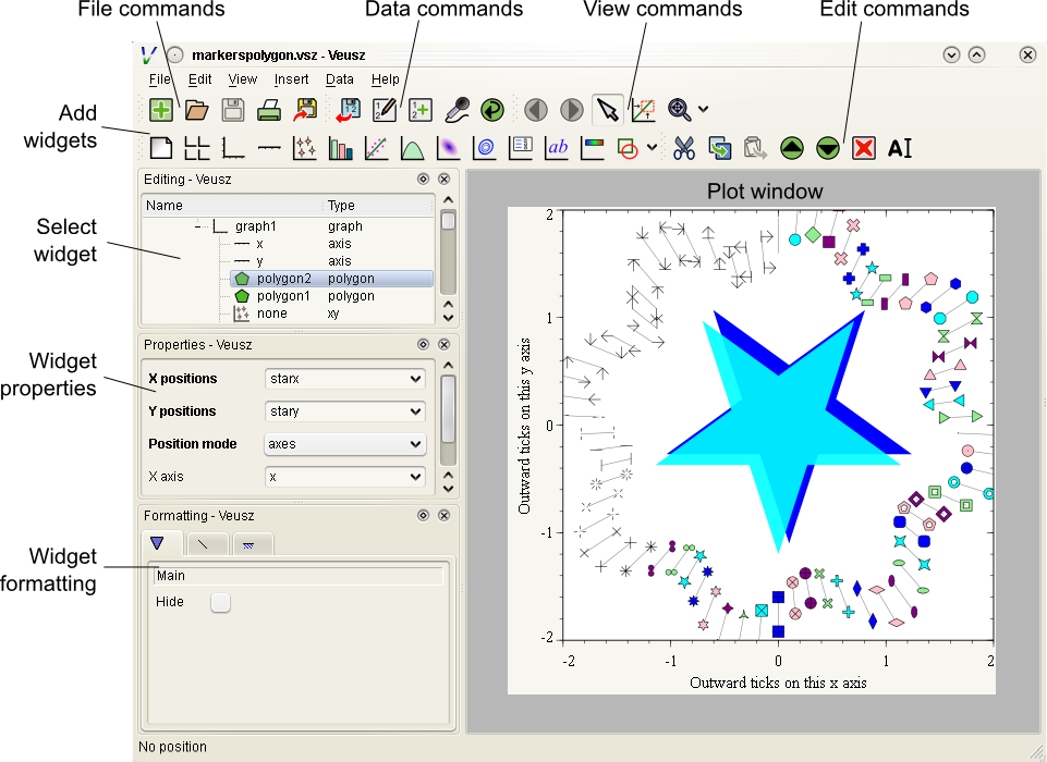
The Veusz window is split into several sections. At the top is the menu bar and tool bar. These work in the usual way to other applications. Sometimes options are disabled (greyed out) if they do not make sense to be used. If you hold your mouse over a button for a few seconds, you will usually get an explanation for what it does called a “tool tip”.
Below the main toolbar is a second toolbar for constructing the graph by adding widgets (on the left), and some editing buttons. The add widget buttons add the request widget to the currently selected widget in the selection window. The widgets are arranged in a tree-like structure.
Below these toolbars and to the right is the plot window. This is where the current page of the current document is shown. You can adjust the size of the plot on the screen (the zoom factor) using the “View” menu or the zoom tool bar button (the magnifying glass). Initially you will not see a plot in the plot window, but you will see the Veusz logo. At the moment you cannot do much else with the window. In the future you will be able to click on items in the plot to modify them.
To the left of the plot window is the selection window, and the properties and formatting windows. The properties window lets you edit various aspects of the selected widget (such as the minimum and maximum values on an axis). Changing these values should update the plot. The formatting lets you modify the appearance of the selected widget. There are a series of tabs for choosing what aspect to modify.
The various windows can be “dragged” from the main window to “float” by themselves on the screen.
To the bottom of the window is the console. This window is not shown by default, but can be enabled in the View menu. The console is a Veusz and Python command line console. To read about the commands available see Commands. As this is a Python console, you can enter mathematical expressions (e.g. 1+2.0*cos(pi/4)) here and they will be evaluated when you press Enter. The usual special functions and the operators are supported. You can also assign results to variables (e.g. a=1+2) for use later. The console also supports command history like many Unix shells. Press the up and down cursor keys to browse through the history. Command line completion is not available yet!
There also exists a dataset browsing window, by default to the right of the screen. This window allows you to view the datasets currently loaded, their dimensions and type. Hovering a mouse over the size of the dataset will give you a preview of the data.
My first plot
After opening Veusz, on the left of the main window, you will see a Document, containing a Page, which contains a Graph with its axes. The Graph is selected in the selection window. The toolbar above adds a new widget to the selected widget. If a widget cannot be added to a selected widget it is disabled. On opening a new document Veusz automatically adds a new Page and Graph (with axes) to the document.
You will see something like this:
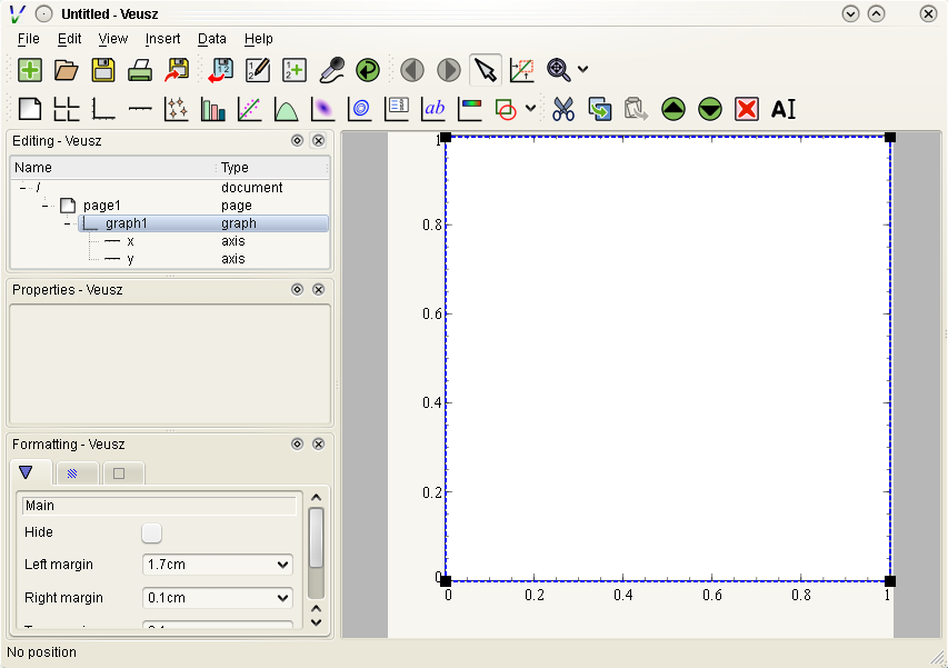
Select the x axis which has been added to the document (click on x in the selection window). In the properties window you will see a variety of different properties you can modify. For instance you can enter a label for the axis by writing Area (cm^{2}) in the box next to label and pressing enter. Veusz supports text in LaTeX-like form (without the dollar signs). Other important parameters is the log switch which switches between linear and logarithmic axes, and min and max which allow the user to specify the minimum and maximum values on the axes.
The formatting dialog lets you edit various aspects of the graph appearance. For instance the “Line” tab allows you to edit the line of the axis. Click on “Line”, then you can then modify its colour. Enter “green” instead of “black” and press enter. Try making the axis label bold.
Now you can try plotting a function on the graph. If the graph, or its children are selected, you will then be able to click the “function” button at the top (a red curve on a graph). You will see a straight line (y=x) added to the plot. If you select “function1”, you will be able to edit the functional form plotted and the style of its line. Change the function to x**2 (x-squared).
We will now try plotting data on the graph. Go to your favourite text editor and save the following data as test.dat:
1     0.1   -0.12   1.1    0.1
2.05  0.12  -0.14   4.08   0.12
2.98  0.08  -0.1    2.9    0.11
4.02  0.04  -0.1    15.3   1.0
The first three columns are the x data to plot plus its asymmetric errors. The final two columns are the y data plus its symmetric errors. In Veusz, go to the “Data” menu and select “Import”. Type the filename into the filename box, or use the “Browse…” button to search for the file. You will see a preview of the data pop up in the box below. Enter x,+,- y,+- into the descriptors edit box (note that commas and spaces in the descriptor are almost interchangeable in Veusz 1.6 or newer). This describes the format of the data which describes dataset “x” plus its asymmetric errors, and “y” with its symmetric errors. If you now click “Import”, you will see it has imported datasets x and y.
To plot the data you should now click on graph1 in the tree window. You are now able to click on the “xy” button (which looks like points plotted on a graph). You will see your data plotted on the graph. Veusz plots datasets x and y by default, but you can change these in the properties of the “xy” plotter.
You are able to choose from a variety of markers to plot. You can remove the plot line by choosing the “Plot Line” subsetting, and clicking on the “hide” option. You can change the colour of the marker by going to the “Marker Fill” subsetting, and entering a new colour (e.g. red), into the colour property.